It's on! And our logo is too
Why the OnTote mark is a plain crate with a switch for a handle.
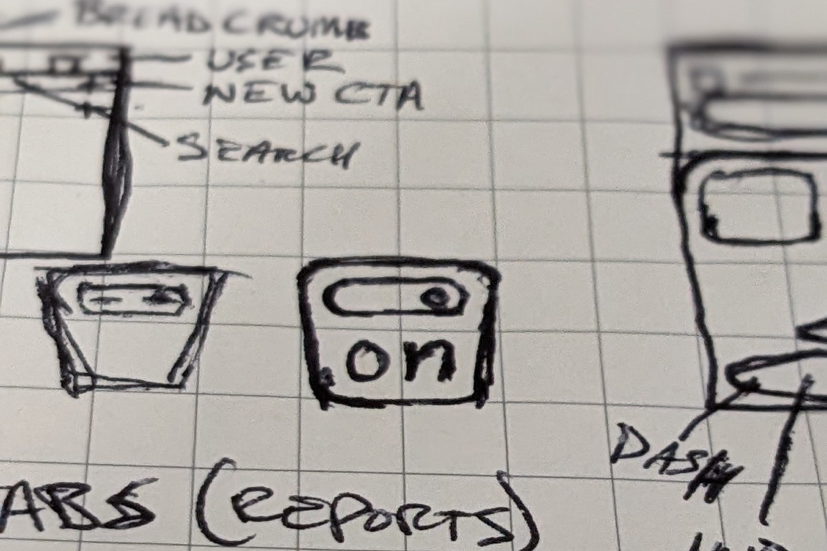
Inspiration everywhere
We explored dozens of OnTote logo directions (including several isometric box directions) but in the end it was a back-and-forth session with Claude running this nifty logo-design-skill that resulted in our final simplified logo direction.
The whole idea in one line: a tote, seen from the front, with its handle slot drawn as an on switch. "Tote" in shape. "On" to symbolize it's available.
They say if you can sketch it from memory, it's the right mark.
What's in the box?
Tote Green (#2C6E54) and a clean neo-grotesque typeface (Libre Franklin).
Our customers rent hard plastic moving crates, so it made sense for the mark to look like one. The shape tapers in and is rounded at the bottom, like a stackable crate.
The slot doubles as a familiar "on" switch. It sits high, right where your hands would go to lift it. If someone who rents glances at it and thinks "tote" or "crate", it's doing its job.
Let's go!
Start a free 14 day trial today or schedule a demo and streamline your tote rental business with OnTote.